Monday, April 30, 2012

Week 8 - Design Finalization


I began this week with a new twist to my concept. As well as representing the filtration of the mangrove through people and screening as I mentioned last week, I also want to represent the contrast the views of the site in relation to the original folie which has set viewpoints. These points indicated the Brisbane River, the Story Bridge, the cliffs and the Mangroves. In the diagram below, I have shown how I am planning to link the ideas of the river, the city and the mangroves.


By layering the elements on top of each other, I can begin to create interesting contrasting shapes that can be used in the physical structure or the internal spaces. If I tried to represent every one of the concepts in the physical form, it could begin to look very messy, so for this reason, I have decided to have the Story Bridge and the Cliffs as the main viewpoints from the building.
I began designing the building by drawing the elements that I would like in each section before then adding them to a rough building footprint. In terms of what elements would go into each rooms, some I came up with on my own, but others I found through researching children’s libraries and spaces. Two of my favourite features have been found through research. One of which was the idea of having the grass areas outside as an extension of the library. for the older kids, this means creating an extension of the social and relaxing area, and for the younger children, giving them a space to burn off some energy whilst also learning through interaction.  I found these images of mounds of grass been used to create play and relaxation areas, and I hope to incorporate something similar in my design.

Grass Loungers (New Ideas Homepage 2009). 

Grass Chairs (Trend Hunter n.d)
I also like the idea of creating fun and interesting spaces for the younger children just like in the picture below which uses books to create an igloo, created by Miler Lagos.

Recycled Book Igloo (InHabitat. 2012). 
The diagram below is a rough sketch where I began to layout the spaces within the library. Further information about the spaces can be seen below.


The building is entered through a foyer which contains an information desk and small exhibition space. The area for the younger children is situated on the right hand side and contains elements such as a bookcase in the shape of the Brisbane River, interactive igloo space, play area and a raised stage for performances and activities. The area is surrounded by booths and tables for parents to sit at whilst watching and interacting with their children and also enjoying the benefits of the café. The wall behind the stage will be a green wall, to soften the area, teach about nature and also block the heat from the Western sun. The outside area will contain a mixture of concrete areas for group activities and more seating and a large grass area with rolling mounds for children to run up and roll down. The area will be fenced in to ensure safety from the public and also the Brisbane River, using a structure similar to that of our folie.

The left hand side accommodates for the older teens and is a large open space that accommodates booths and seating for social interaction and relaxation. There will be three large wooden poles that puncture through the space, which was diagrammed at the end of last week’s blog. These will also create a centre points for seating to wrap around. The space will also have a green wall which will run alongside the stairs and become the beginning of a water feature which runs allow the edge of the wall. At a certain point, the water feature will continue outside to give the illusion that the water is flowing through the glass window. Upstairs (which is not shown in this drawing) will house a computer room and room for quieter individual study. The downstairs area also has access to the café, but through a different serving area to the younger children’s area. There is also outdoor seating as well as the grass mounds and chairs to relax against.

When beginning to draw the floor plan to a scale, I found that the building was quite large, so the large open spaces were reduced in size and the exhibition space in the foyer was removed. This can be seen below. 


References:
InHabitat. 2012. “Miler Lago Recycled Book Igloo” Accessed April 23rd, 2012. http://inhabitat.com/miler-lagos-awesome-igloo-is-stacked-high-with-hundreds-of-recycled-books/
Trend Hunter.n.d. “DIY Grass Chairs” Accessed April 30, 2012. http://www.trendhunter.com/trends/grass-chairs-eco-friendly-organic-lawn-furniture#!/photos/41022/1
New Idea Homepage. 2009. “Public Lawn Lounge Chairs” Accessed April 25, 2012. http://www.inewidea.com/2009/07/17/8297.html


Monday, April 23, 2012

Week 7 - Concept and Design Progress


My first stage of development from last week to define the parameters for each space and define what would be in each space. I did this by getting the bubble diagram and listing the types of spaces I would like within the older and younger children’s areas. I have decided that because of the libraries proximity to the State Library at South Bank and the City Library in Brisbane Square, the Library Park will be more of a reflection, fun and interactive learning space. Where children come to learn through playing and interacting with others. For this reason, each of the older and younger have open social areas and smaller, quite areas for smaller group and individual learning. The diagram below shows the space planning.


I then began to think of how the quiet and social areas could be split to avoid people been annoyed by other patrons. From personal experience, I find when I am in social or studious situations; the presence of young children is often annoying and distracting. For this reason, I have chosen to split the younger and older children’s areas. This will also make it easier to design spaces specifically for the age group. The diagram below shows how I have experiment with how to split the two age groups, either with different levels or different sections of the building.


I then began to think of how I could relate the idea of the mangrove and filtration to the building design. Using what I have learnt from the Exemplar buildings, I have decided to use patterns to filter views and create spaces. This can be achieved through the screens with natural patterns on them, or as seen below, the upright folie structures to create perforated walls. I also thought of the way people will move through not only the library, but also how they move around a space. Because of the juxtaposition of the social and quite spaces, I will have to ensure I consider the filtration of people by examining the size, layout and furniture of each space.


When looking at an image of a city skyline, I found a connection between the differing heights of the buildings and the variation in mangrove roots. I have diagrammed this in the image below and it has inspired me to use varying levels as a way to represent not only the mangrove structure, but also how that relates back to the city.


I then began to roughly layout the spaces in the form of a rough floor plan and perspective, which can be seen below. I have already varied from my original bubble diagram in terms of the café placement. Instead of the café been situated in the children’s area, I have placed it between the teen and children’s area. This will ease pedestrian traffic through the young children’s area to prevent safety issues when it comes to the toddlers. It also means that the older children and teens can distance themselves from the families if they want to. I have also shown a high emphasis on outside areas for learning which I believe is important not only for health issues, but also to promote learning about the natural environment.


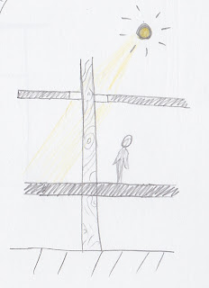
Finally this week, I have drawn a small vignette that shows a “mangrove root” protruding through the building with a glass section at the ceiling juncture. This is playing with scaling and I aimed to create the illusion of a natural element that links back to our folie. Hopefully with the inclusion of elements such as this which have the illusion of structure in the building, will allow the patrons to reflect on the strength roots give the mangrove roots.


Tuesday, April 17, 2012

Week 6 - Project Brief and Design Development


After completing my research on exemplar library and public buildings, I was able to extract some themes and design ideas that I would like to incorporate into my design. Although I have yet to finalise the brief, which will be outlined later in this blog entry, I’m going to use these ideas to generate some initial diagrams which will begin the design process. One of the common factor, that stood out from the exemplars was the architect’s intent to make the library a comforting and welcoming space. In the case of the Seattle Public Library, the designers went as far as to have a living room space for people to visit for the sole purpose of relaxing and reading a book. This idea of creating a fun, home space is usually one used predominately in children’s libraries, to enable children to learn and interact in a familiar setting. For a library whose main users are from 6-18 years old, this type of space could be used as a general theme and changed slightly in areas to accommodate for specific users.

Many of the exemplars also tried to break away from the stereotypical library when it came to the entrance and the interface between the inside and outside of the library. The architects have broken down the imposing facades of the library to create a welcoming and inviting space. The two main examples of this is the Yale University’s Beinecke Rare Book and Manuscript Library and the Max Webber Library. Both use glass as the primary material for the ground floor, to enable people to see into the spaces which host a variety of uses, from exhibition, library, public and relaxing spaces.

The connection from this open entry space is then, in some cases, continued up into the building through the use of voids to connect levels. The size of the voids varied in the exemplars, from the Max Webber Library which spans on story, to the Seattle Public Library where to void occupies a majority of the building. As well as serving to enhancing natural light and air circulation, these voids enable to users of the space to make a visual connection to many levels, instead of just one like in typical buildings. As it can be seen in the diagram below, the connection allows people to see other people using the spaces as well as allowing people to use the void as an orientation point. 


In the case of the Seattle Public Library, this void became such a feature, the entire Dewey decimal system is laid out on the ramp the winds its way around the void. I have always been enjoyed buildings with voids, because it allows you to view the space in a completely different way. You can retract yourself from the space and watch how people use the area. An example of this is the Gallery of Modern Art in South Bank, Brisbane, which has a void situated about where the interactive activities are held.
Another interactive feature used in an exemplar Birkenhead Library and Civic Centre is the use of patterns and shapes to create visual screens. The screens were designed to represent the natural landscape on the site and how people look through the layers of nature. This idea is very relevant to my folie design which focussed on mangroves and how they filter the water to remove toxins. Below I have done a sketch that uses the vertical structures of the Birkenhead façade to create a screen over an image of the Kangaroo Point end of the Story Bridge.


This idea of an interactive façade is also used in the Seattle Public Library, which has a section at the bottom where the façade separates from the building to create a public space. This idea could be translated into the Howard Smith Wharfs site to create undercover seating or walkways. This space could also be used as a transitional space, where children can be outside but still within the protected library space. Below is a diagram that shows how these spaces could be achieved.


In planning a library to be used specifically by people between the ages of 6-18 years old, there will have to be a variety of spaces for various age brackets. This is necessary because there is a large gap in how and what children use libraries for, from mother’s taking children to story times to school students using the space for school work and research. For this reason, the spaces will be split into a children’s area, aimed for 6-12 year olds that is a more relaxed space with a mixture of individual and group areas. This space will be fun and interactive and linked directly to a contained outside area, café and smaller rooms for organized activities. The older kids will have access to a computer area, study rooms, library area and outside working spaces. As with the younger children’s areas, these spaces will be flexible and comfortable spaces for kids to work and play. These spaces can be seen in the bubble diagram below.


With the building size restricted at 500m2, there is a lot of space to play with. For this project, we are assuming that none of the outside areas are counting towards the footprint size. I am going to assign some rough estimates to the rooms sizes, but these will be subject to change if necessary. The large children’s area will be 100m2, the computer area 75m2, library and study area 75m2, café 50m2, foyer 30m2, allowing 30m2 for smaller rooms and 50m2 for staff areas.
The diagrams below show examples of the spaces that I would like to create within the library park. The use of small booth areas can be used for group study sessions or for friends to use to hang out, these spaces would flow outside to garden areas that reflect the natural habitat of the river. Mangroves could be planted along flowing streams of water pumped from the Brisbane River, with vertical structures placed in the stream to represent the folie. The upright folie structures could also be used as partitioning within the library space or as a fence surrounding the children’s garden. Finally, the traditional idea of bookcases could be warped by having different shapes and elements protruding from the walls to create nooks for children to sit and play in, as well as creating storage area for library staff.


Wednesday, April 11, 2012

Week 5 - Exemplar Library Designs

As a starting point to designing our library spaces, we were instructed to research exemplar library designs which could inspire and influence not only our design but also the type of library we wish to create. When I began my research, I had no particular theme or design style in mind because I wanted to keep my options open to the different styles of library. The first exemplar I found was the Max Webber Library in Blacktown, Sydney which was designed by Francis-Jones Morehen Thorp Architects (FJMT) (Heneghan, n.d.). The architects designed the library using the theory that a library is a meaningful twenty-first century building where anyone in the community can have access to knowledge. The concept of community and acceptance is tied into the design by having the entry level designed similar to that of a “market hall at the centre of medieval villages, which were open on all sides to invite in the life of the community” (Heneghan, n.d.), which can be seen in the front façade below.


Max Webber Library Facade (Heneghan, n.d.).

The transparency of the bottom level also allows passersby to view the function of the spaces without entering, creating a link between the interior and exterior to prevent the feeling of confinement. The library is largely planned from diagrams and uses the movements of people to dictate the spaces, an example of which can be seen below, as the stair case is used to lure people further into the library. 

Void in Max Webber Library (Heneghan, n.d.).

The architects stated that the key to creating a successful public space is comfort, accessibility and consideration of the users (Heneghan, n.d.).

The second exemplar library that I discovered was slightly different because of the fact that it was renovated to become a mixture of contemporary and historical architecture. The Imperial Library situated in Tokyo, Japan, was built in 1906 and expanded in 1929 (Silloway, 2004). Tadao Ando was commissioned to renovate the historical building into a children’s library, which is known as The International Library of Children’s Literature, and was completed in 2002 (Silloway, 2004). Whilst few major changes were made to the structure of the building, Ando added simple modern features which create a “dynamic juxtaposition” (Silloway, 2004) to both the facade and the interior spaces. One of these was the addition of a glass structure to form an entryway, which is highly contrasted against the existing renaissance style facade, which can be seen below. This addition hints that there may be more to the building than a stuffy historical library which can be seen as foreboding and uptight. 


Entry to the International Library of Children’s Literature (Silloway, 2004).

The use of glass as a facade treatment is also used extensively in other areas of the building, but instead of building off from the existing structure, it encircles it to create circulation space in the space between the old and new sections. This space is furnished with chairs and lounges to create a transitional space in the library, which can be seen below.
Transitional space between facades (Silloway, 2004).

The other major alternation Ando made was the installation of two large wooden cylinders in the existing reading room to create a Children’s Book Museum and smaller, intimate spaces within the original larger circulation spaces. The picture below shows one of the new spaces created by Ando.
Children’s Book Museum (Silloway, 2004).

The third exemplar library that I researched was the Seattle Public Library which was opened in 2004 and designed by the Office for Metropolitan Architecture (OMA) (Ouroussoff, 2008). The building, which is situated on one of Seattle’s main roads, has entrances on both sides of the block to allow easy access to the public, which opens into the children’s library and foreign language resources (Ouroussoff, 2008). The architects saw the idea of a library to be a place to celebrate books, showcase new technologies and a place where people can do to learn, discuss and reflect (Ouroussoff, 2008). This resulted in a dynamic eight story building, with each floor plate size varying depending on the function, which gives the building its warped shape, which can be seen below.
Exterior façade of the Seattle Public Library (Ouroussoff, 2008).

The façade is constructed from steel and glass, using triangles and angled shapes to create the warped shapes of the building. The junction between the building and the ground is not a simple one. In places, the façade branches out to create sheltered public shapes between the façade and the building which are light and appealing because of the use of glass as the primary material. One of these areas can be seen below.

Public space created by separation of façade and building (Ouroussoff, 2008).

Similar to the Max Webber Library, the human movement around the building is a major feature of the design, both through the illumination of escalators, which can be seen below, and the way the library is laid out. These escalators travel up to the “living room” which is a carpeted area that contains the fiction stacks and create a comfortable, homely environment.

Escalators travelling up to the “Living Room” (Ouroussoff, 2008).

Above the ‘living room’ is an area known as the ‘Dewey Ramp’ which houses the non-fiction books. The layout of this area is similar to that of the Guggenheim in New York, with a ramp circling up four stories of the building around a central void with books lining the walls. This is used instead of traditional book cases to layout the Dewey decimal system, with 0 at the top of the ramp and 999 at the bottom and was designed to allow people to continually browse through the books (Ouroussoff, 2008). The void in the centre of the building is the allows a physical connection between levels. At the top of this ramp is the reading room, which is on the top floor and has views out to the Puget Sound and surrounding mountains. 

The fourth exemplar is the University of Poznan Library which was designed by Neostudio Architects and in situated in Poznan, Poland. Completed in 2009, the building is an extension of the Collegium Muis and is situated in the heart of the historical district ( Saieh, 2009). The building itself is hidden on three sides by historic buildings, which the architect has acknowledged through the use of glass and sandstone as external cladding. The sandstone patterning is a replication of the exterior facades of the historic buildings whereas the glass represents the modern side of the design, which can be seen below.  


University of Poznan Library (Saieh, 2009).

This mix of historical and modern materials is infused into the indoor spaces, which can be seen below. Similarly to other student used buildings, the designers choices were aimed at accommodating for them to ensure the building suited their tastes and needs. This was achieved by the client been a part of the schematic design stage, allowing the students to feed their ideas into the design through the university faculty. 

Indoor learning space (Saieh, 2009).

The fifth exemplar building I am investigating is Yale University’s Beinecke Rare Book and Manuscript Library, designed by Gordon Bunshaft and was constructed in 1963. To this day, the library is the largest building in the world devoted to the preservation of rare books, housing 500,000 books and serveral million manuscripts (Perez, 2010). The major issue with this building was “to provide ample lighting in the interior for people to study and read and to make it a pleasantly habitable space while limiting the amount of light that affects the stored volumes” (Perez, 2010).  This challenge was overcome by the exterior façade, which was made from marble, granite, bronze and glass, which creates an opaque surface, allowing the filtered light in, which is harmless to the fragile contents of the building. This effect can be seen below.
Light filtering through exterior cladding into the interior plaza (Perez, 2010).

The spatial layout of the building is also quite different from that of a normal library. The entry floor of the building is completely encases in glass which allows passersby to view the grand exhibition hall, which can be seen below. Upon entering the building, visitors are also presented two large marble stairs cases which travel up to the indoor mezzanine level which encircles the glass tower that houses the rare books. This illuminated glass tower becomes the feature of the building, clearly showing the purpose of the space to users. 

Entry level of the Beinecke Rare Book and Manuscript Library (Perez, 2010).

The final exemplar is have researched is the Birkenhead Library and Civic Centre, Auckland, designed by Archoffice and completed in 2009. The concept behind this building was based upon the large trees that were found on the site and how you could look between the trees through to the view. This created the themes of solid and void, pattern, transparency and form (Saieh, 2010). The architects intention was to have a “pleasant and verdant quality of light available within the building that subtly changes during the day, leading to the building becoming transparent at night” (Saieh, 2010) which can be seen below.

Exterior façade of the Birkenhead Library and Civic Centre (Saieh, 2010).

The themes of lighting, pattern and transparency have also been translated into the indoor spaces of the building. The design is very user friendly, with the use of a variety of spaces for different uses and the addition of a drive thru book return. The indoor spaces are very appealing because of the natural lighting that filters through the patterns in the walls, lampshades and ceiling which can be seen below. This intricate patterning creates spaces that are so different from the run of the mill libraries.

 Interior View of a library space (Saieh,2010).

 Saieh, Nico. 2010. “Birkenhead Library and Civic Centre”. Accessed April 2nd, 2012. http://www.archdaily.com/63926/birkenhead-library-and-civic-centre-archoffice/


Perez, Adelyn . 2010. “Beinecke Rare Book and Manuscript Library”. Accessed April 2nd, 2012. http://www.archdaily.com/65987/ad-classics-beinecke-rare-book-and-manuscript-library-skidmore-owings-merrill/
 Saieh, Nico. 2009. “University of Poznan Library”. Accesses April 2nd, 2012. http://www.archdaily.com/37207/university-of-poznan-library-consultor-apa-bulat-neostudio-architects/
Ouroussoff, Nicolai. (2008). “Seattle Public Library”. Accessed April 2nd, 2012. http://www.arcspace.com/architects/koolhaas/Seattle/
Silloway, Kari. 2004. “International Library of Children’s Literature, Tokyo”. Accessed April 2nd, 2012. http://www.galinsky.com/buildings/childlit/index.htm
Heneghan, Tom. n.d. “Max Webber Library”. Accessed April 2nd, 2012. http://www.architecturemedia.com/aa/aaissue.php?article=13&issueid=200605&typeon=2